
 CAD - Canadian Dollar
 Frequently Asked Questions
Welcome to our Frequently Asked Questions page. We hope you find the information you are looking for here.
What file format should my file be?
- We strongly recommend you prepare your file as a high-resolution with bleed.PDF file
- You may also send the file in the following types: jpg, jpeg, psd, tif, tiff, eps, ai, and png
- We prefer that you send PDF and EPS files with outlined fonts. Remember to add crop marks and flatten your files before uploading.
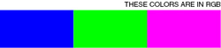
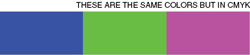
Which colour mode should my file be?
Your files should always be in CMYK, anything else may result in a colour shift when other colour modes are converted into CMYK.
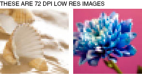
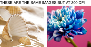
Which resolution is preferred?
Images and artwork should be 300 DPI
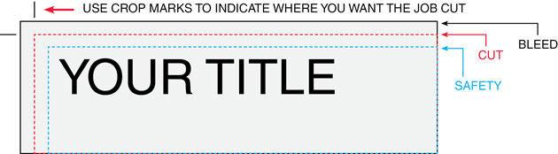
How should I set my bleed and Crop marks?
Bleed must extend further than the cut line. Please keep all text and anything you do not want cut at least .125" away from the cut line. When sending a .eps or .pdf, make sure you include crop marks so we can cut the job correctly.
All images must be embedded and all type must be embedded/outlined
The file you upload to BEST DEAL GRAPHICS & PRINTING must have font/imaged embedded or outlined, or else, we will not be able to process your file.
How to embed images?
Adobe InDesign: Window > Links
Choose the image you want to embed from the list and click on the arrow and select "Embed File".
Adobe Illustrator: Window > Links
Choose the image you want to embed from the list and click on the arrow and select "Embed Image".
Instruction on how to convert to outlines
Select your text box. Under "Type menu", select Create Outlines.
Borders
If the border is too close to the cutline, it may be cut off-center slightly.
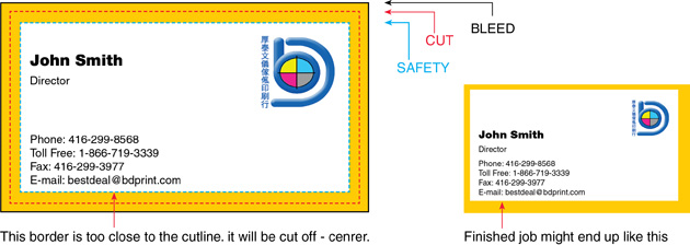
For products such as business cards, we would recommend customers to avoid borders. If the border is too close to the cutline, it may result in the final product to be off-center slightly.
Files are backed up for proper orientation
In order to ensure files are submitted properly for proper orientation, we will require files to be submitted HEAD TO HEAD. BEST DEAL GRAPHICS & PRINTING also requires to have files submitted as one file, for example, a one-sided file should consist of 1 PDF, one page, and two-sided file should consist of 1 PDF, 2 pages. Below are examples on how to submit file:
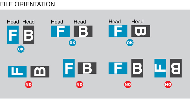
We print using work and turn; therefore, files must be imposed properly to back up properly. Here is an example of how files should be set:
Overprinting
Overprinting refers to the process of printing one colour on top of another. If you do not want this to happen, please make sure that the overprint options are turned off and switched to knockout in your document.
In this case, the logo was set to overprint. The colors from the logo are mixing with the colors from the background. Unexpected results may occur if you have accidentally set certain objects to overprint. Always check logos and other artwork before submitting.
Transparency Issues with PMS colors
Transparency effects are generally not preferred in printing, and only on screen. It causes ripping issues and elements to disappear. To prevent this, do not use any shadow, glows and transparency on top of spot colour - always convert your spot colour to CMYK before using any transparency effects.
Can I submit a front and a back in the same file?
No. We are now specifically set up to process one side at a time, and this requires that each side of a job must be on a separate file.
How should I set up a Spot UV job?
When creating a Spot UV job, You must include a Spot UV template file along with the regular full-color file. The Spot UV template file is used to show where the UV will be placed.
uv.jpg
How can I set up a File for Silver Ink?
Silver ink files must be sent in a vector format. You must use a vector program, like Illustrator or Indesign, to call out the object you want in silver ink. To indicate the silver ink, you must set the object color to Pantone¨ 877 C. Any other color will not be accepted as silver. Also, labeling the layer as "silver mask" or "silver" will not qualify your file.
Remember, silver is a spot color and transparencies like drop shadows should be avoided. We recommend using 100% silver, however, we are able to print silver on a gradient and different percentages of silver.
Rich black and Total Ink Coverage
We are limited maximum ink coverage of 300%, anything over may result in many print related problems such as cracking. To achieve a rich black, we will recommend the values 30C20M 20Y 100K
Black text
We will always require 100% K for black text (C0, M0, Y0, K100). Rich black should not be used for type or thin lines because it will result in fuzziness and misregistration issues. Rich black is an ink mixture of solid black, 100% K, with additional CMY ink values. This results in a darker tone than black ink alone. If you print black alone as 100% K, the resulting black may not be as dark as you might like. We recommend using C 60 M 40 Y 40 K 100. This will give you a deep, dark, rich black.
Blues and Purples
Blues and Purples have always been a problem in the printing industry because the two colours are so close together in the CMYK spectrum. In order to ensure the two colours come up the correct tones, leave at least 15% differences in your Cyan and Magenta Values. (Example C100/M85/Y0/K0)
- For print to look blue, Cyan>Magenta by 15%
- For print to look purple, Cyan < Magenta by 15%
Red and Orange
Red and Orange are also problematic on press because the two colours are close together in the CMYK spectrum. In order to ensure the two colours come up the correct tones, leave at least 15% differences in your Magenta and Yellow Values. (Example C0/M100/Y85/K0)
- For print to look Red, Magenta > Yellow by 15%
- For print to look Orange, Magenta < Yellow by 15%
Vector Vs Raster
Vector images use mathematical equations to define each component of an image. This allows vector images to retain their high-quality at any size. Programs like Adobe Illustrator, Corel Draw, or Adobe Freehand uses vector graphics. Vector images should be used for all text and logos if possible. They result in the clearest image and can be re-sized without losing resolution.
A raster image is composed of a collection of tiny dots called pixels. When these pixels are small and placed close together, they fool the eye into forming a single image. Raster images work great when subtle gradations of color are necessary. Because they contain a fixed number of pixels, a major disadvantage of raster images is that their quality suffers when they are enlarged or otherwise transformed.
We would also recommend fonts and logos to be vector for print with maximum clarity.
How do I export a PDF correctly?
When exporting from any program such as Indesign or Illustrator, use these settings to make sure your .PDF files export correctly.
Export settings for .PDF files
- Adobe PDF Preset is set to: Press Quality
- Compatibility is set to: Acrobat 4 (PDF 1.3)
- Compress Text and Line Art is set to: Off
How do I get a grayscale image in a CMYK document?
Grayscale images that are converted to CMYK will have a color shift in the final print. That shift may be green or yellow. Always check the CMYK values of your grayscale in the final CMYK document. If there are other values other than K in your grayscale image, there is a chance that the color will vary.
To eliminate all values other than K, use your Channel Mixer (adjustment layer) in Photoshop, then click "Monochrome" and adjust accordingly.
What is banding?
Many things can cause banding. Banding can be caused by the program that it is exported from, such as Indesign or Corel. Also, too many gradient steps, for example, going from a very light color to a dark color, in a small area will cause banding. To prevent this, check your digital files before sending. If you use a gradient, make sure it has enough room for a smooth transition.
How can Pantone color affect the way my job prints?
There are three different ways Pantone colors can affect the way your job prints. The first is by object effects, such as shadows or glows, on top of your Pantone colors. When a Pantone color is under these object effects, transparency issues show up during printing. To avoid this, convert all your Pantone colors into CMYK before submitting your order. The second way Pantone colors can affect your file is when you use transparent images. To fix this issue, convert all your Pantone colors into CMYK. If you need to have a Pantone color in your art, for example when doing a silver 877c job, you must create a clipping mask around the image so the white area will not show up. This must be done before submitting the order. The last way Pantone colors can affect your order is the color conversion between a Pantone color and CMYK. All of our normal printing is done in CMYK unless you specifically order a Silver, MU, or Custom job. If you use Pantone colors in a job that will print CMYK, your job might print with undesirable colors. If you send in a job with Pantone colors, the CMYK conversion will change the Pantone color. Before sending your order, make sure all Pantone colors have been converted to CMYK.